Removing Graph Clutter: Don’t Forget the Leader Lines

Removing Graph Clutter: Don’t Forget the Leader Lines

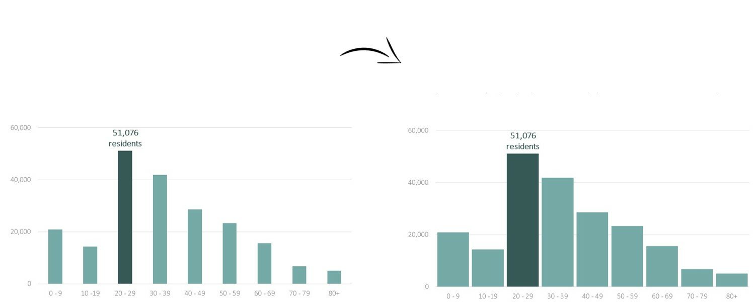
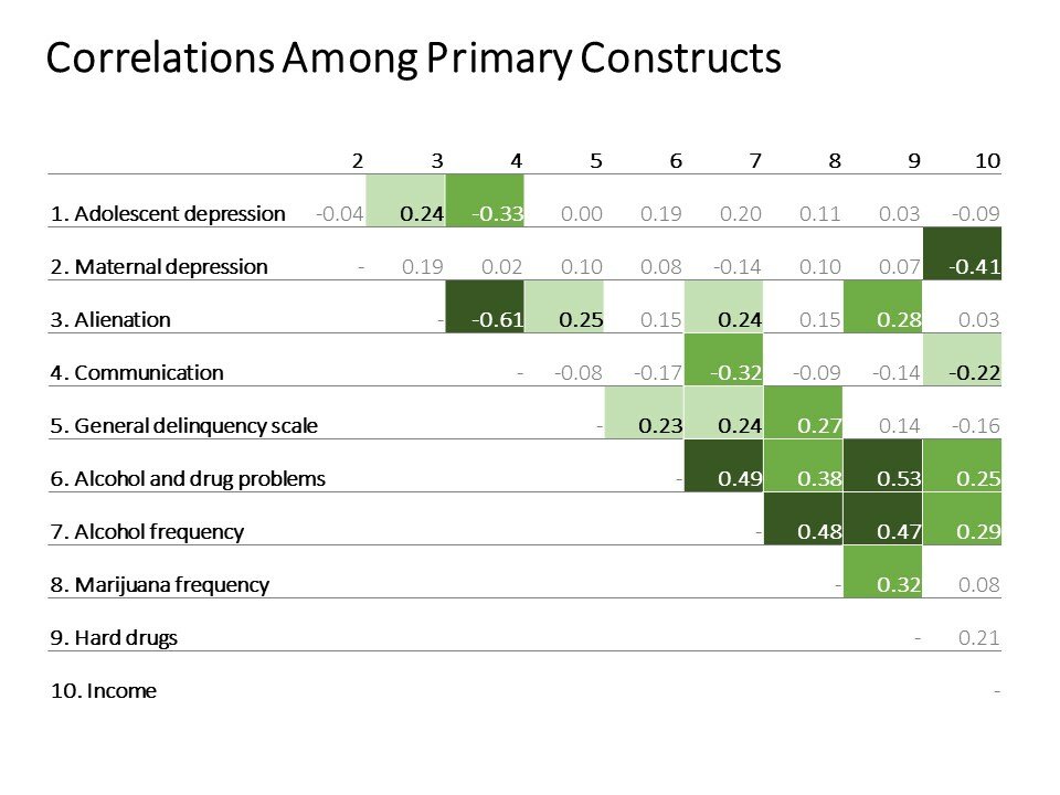
Software typically gets better with time. New graph types are added, more color palettes are available, and editing tools are easier to locate and faster to use. Excel 2013’s leader lines are an exception. Leader lines are those gray or black lines that connect the labels with…

Continue reading →

Formatting Months, Days, and Years in Excel

Formatting Months, Days, and Years in Excel

Does your file include any dates? If so, check out these simple formatting tips so that your dates are displayed in the style you want. Selecting Your Preferred Date Format If your spreadsheet contains dates, you can select either the Short Date or Long Date…

Continue reading →

Quickly Visualizing Patterns with Excel’s Data Bars

Quickly Visualizing Patterns with Excel’s Data Bars

Data bars are miniature within-cell bar charts. I primarily use them to quickly explore patterns in my dataset. Sometimes I decide to make an actual bar chart of the data later on. Other times, I’m simply using these tiny charts to help my brain spot…

Continue reading →

Rakesh Mohan on Getting the Attention of Your Audiences

Rakesh Mohan on Getting the Attention of Your Audiences

In this photo, everyone, including the baby, appears to be paying attention to the person sitting in the center. Rakesh took this photo in 2007 when he visited his village in India where he spent first two years of his life.  This was his first…

Continue reading →

Letting Spreadsheets Do the Heavy Lifting: Number Formatting Tips

Letting Spreadsheets Do the Heavy Lifting: Number Formatting Tips

I bet you’ve got better things to do than fiddle with your spreadsheet for hours on end. And why rely on Excel’s default settings when you can easily format your spreadsheet to fit your exact preferences? There are numerous formatting adjustments you can make to…

Continue reading →

Adjusting Your Bar Chart’s Spacing in Excel

Adjusting Your Bar Chart’s Spacing in Excel

Let’s pretend you’re graphing age distributions for a given county. You carefully formatted your histogram: you removed the border, lightened the grid lines, wrote a descriptive title and subtitle, selected customized RGB color codes, and called attention to a section of the graph with the saturated action…

Continue reading →

Introducing the Essentials, a Chart Choosing Tool

Introducing the Essentials, a Chart Choosing Tool

Last summer, my husband was traveling for work and I had the house to myself for an entire week. I could’ve binge-watched Sex and the City or eaten crumbly crackers in bed, his one-and-only marriage deal breaker. Instead, I designed my own chart taxonomy (while…

Continue reading →

Heat Table How-To in Excel

Heat Table How-To in Excel

Just because I adore graphs doesn’t mean that I shun data tables. I insert the occasional table inside the body of my report, and each report’s appendices are full of tables, tables, and more tables. When creating traditional tables, I follow the Dark Horse Analytics guide….

Continue reading →

Six Alternatives to the Clustered Bar Chart

Six Alternatives to the Clustered Bar Chart

We can all agree that 3-d exploding pie charts are pretty rotten. My vote for worst chart? The clustered bar chart. I see clustered bar charts everywhere. E-V-E-R-Y-W-H-E-R-E. On pages 1, 2, 3, 4, 5, 6, 7, 8, 9, and 10 of reports. In slides 1, 2, 3,…

Continue reading →

Traditional Table for the Report, Heat Table for the Presentation

Traditional Table for the Report, Heat Table for the Presentation

Back in college I was so obsessed with data that I voluntarily wrote a 66-page thesis about adolescent development. The “Before” Version: Data Table in the Research Report My paper was filled with these: A major piece in the data visualization puzzle is understanding your…

Continue reading →

Page 1 of 11 1 2 3 4 5 ... Last →

Related Links:

Togel178

Pedetogel

Sabatoto

Togel279

Togel158

Colok178

Novaslot88

Lain-Lain

Partner Links