Apr012015

I demonstrate how to insert a brand new line chart that displays the number of professors who are employed between Fall 2001 and Fall 2009.
I demonstrate how to insert a brand new line chart that displays the number of professors who are employed between Fall 2001 and Fall 2009.

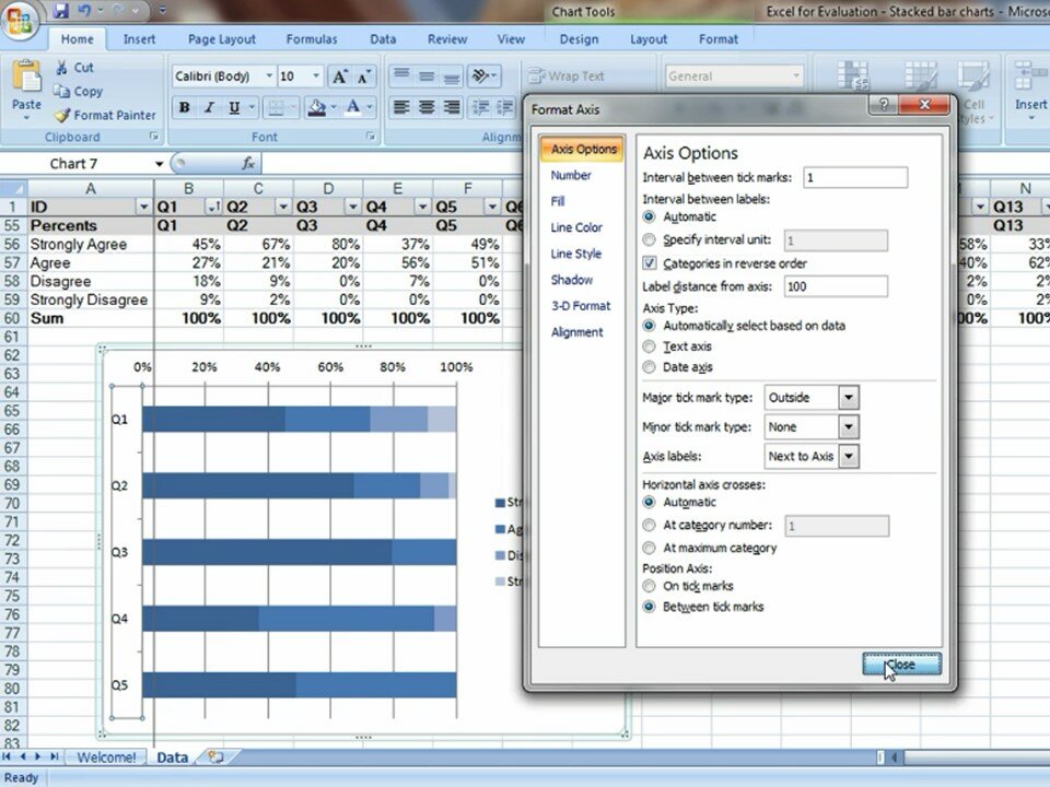
Stacked bar charts are an excellent option for displaying part-to-whole relationships.

I demonstrate how to highlight or select your data table and insert a brand new chart.


Guest blog post for ICTworks on producing effective charts in simple software programs like Microsoft Excel.
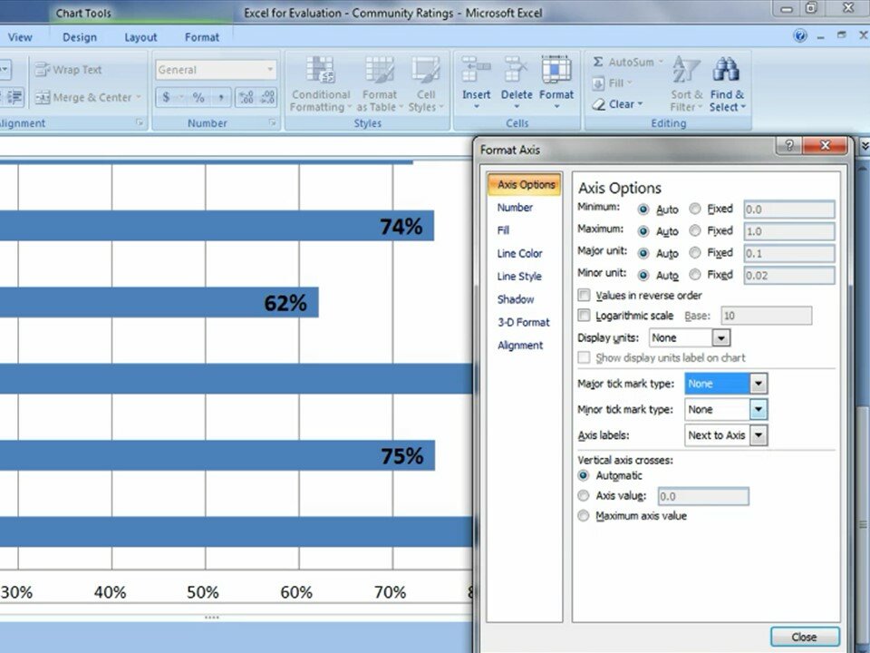
How to maximize data-ink ratio by removing distracting gray lines like tick marks and grid lines.
Comments