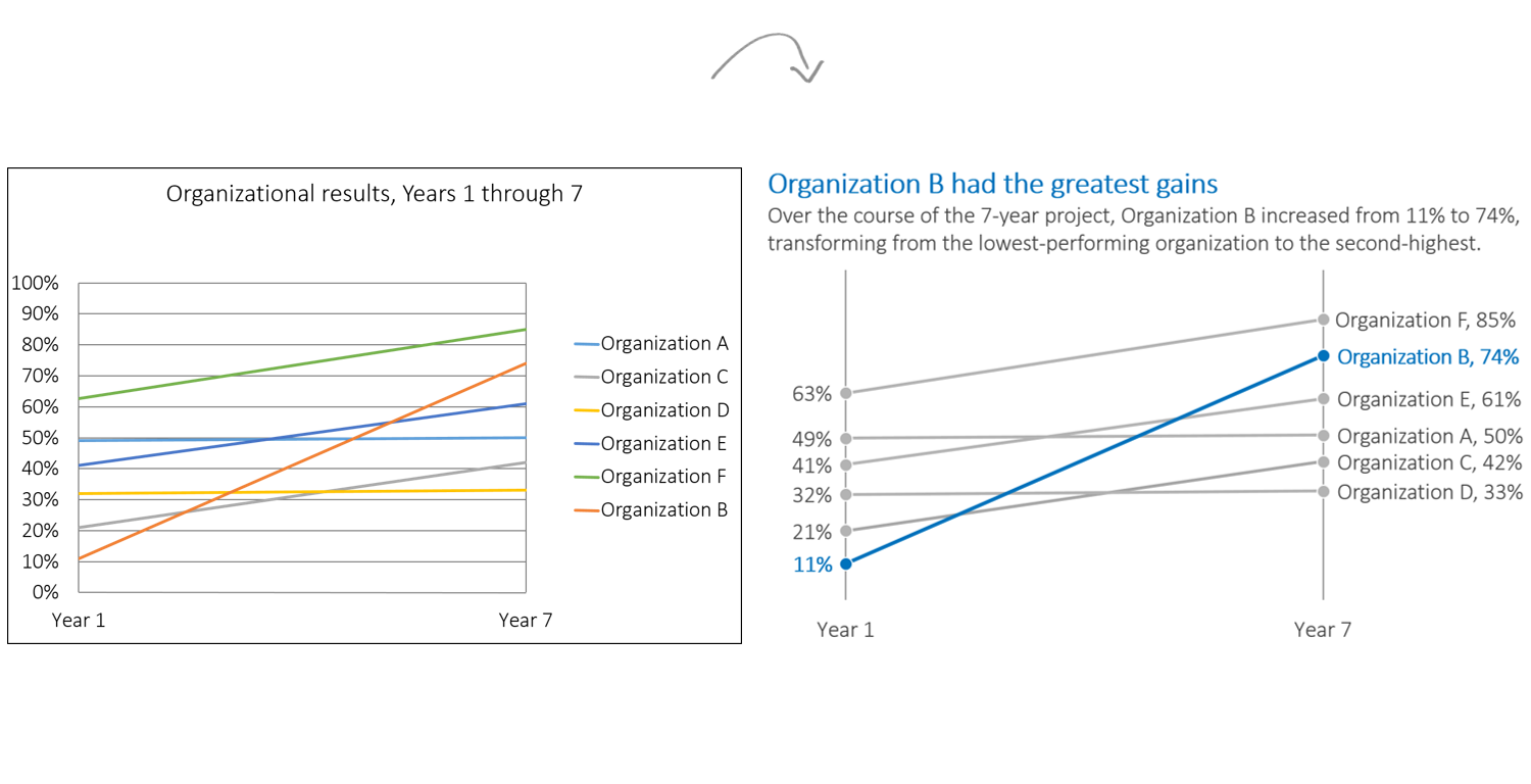
I teach about data visualization a lot. And it basically comes down to two techniques: simplification and emphasis. Here’s a default graph with fictional data: First, simplify the graph. Remove the border. Remove the horizontal grid lines. Remove the vertical axis. Remove the legend. Remove…

