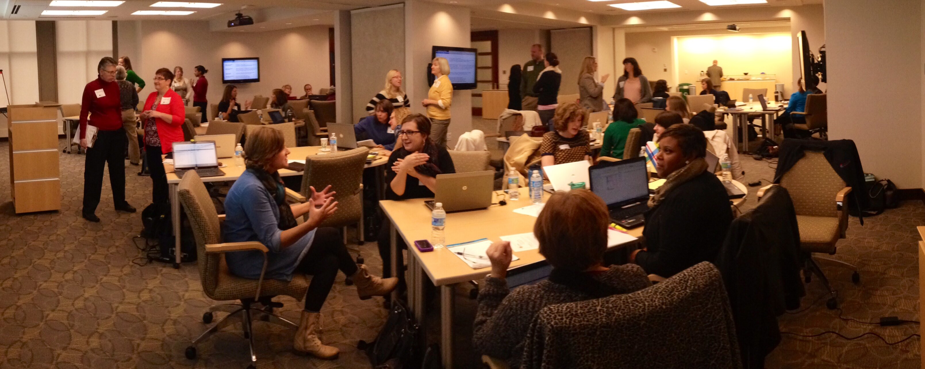
Have you ever emailed a report to a client and wondered whether they even read about the results? Have you tried sharing results during in-person meetings only to watch their eyes glaze over? If so, this workshop is for you. As data becomes easier and cheaper to collect, the sheer volume of information available to us (and to our clients) can become overwhelming. Visualizing data through charts, graphs, and diagrams is one strategy for delivering bite-sized information that stakeholders can understand at a glance and retain for the long run.
During these workshops, we discuss how to select appropriate chart types; emphasize key findings with color; and take the guesswork out of your graphs through titles, subtitles, and annotations. We focus on researcher-specific considerations: designing with stakeholders’ information needs front and center, using readily available software like Microsoft Excel, and thinking through a dozen chart types—dot plots, small multiples, heat maps, and more—that can be applied to the social sciences. We conclude with strategies for sharing visualizations through videos, handouts, slidedocs, social media, and dashboards. Attendees leave with the critical thinking skills and technical prowess needed to create visualizations faster and easier than they ever thought was possible.
After the workshop, participants will be able to:
Anyone with an interest in presenting information more effectively through charts, graphs, tables, and diagrams. No computer programming experience or graphic design skills needed.
I teach half-day, full-day, and multi-day workshops.
Typical agenda for half-day workshops:
Typical agenda for full-day and multi-day workshops:
We can use one of my sample datasets or apply the skills to your organization’s data. Sample datasets include:
“This was by far the best professional development opportunity I’ve had in the last 3 years. Thanks so much for the hands-on learning opportunities. I left this workshop feeling that I could immediately implement what I learned, which is rare!”“This was the best workshop we’ve ever had at our organization.”
“Ann did an amazing job. She was engaging and an excellent facilitator. This workshop has inspired a lot of confidence in my ability to visualize data and I would be interested in seeing what Ann would have planned for an intermediate or more advanced workshop on this topic.”
“I came into the workshop thinking I already had a good foundation in data visualization but it turns out I still had lots to learn! Thanks for the great tips and for so expertly walking us through the new charts you introduced.”
“Really excellent and a totally worthwhile investment of time. Ann’s humor, adaptability to her audience, vast knowledge, creativity and hands-on approach made this one of the best workhops I’ve ever attended.”
“I really liked having everyone working from the same Excel doc prepared ahead of time so you have all the lessons there after the training. I’ve seen it done so poorly in other trainings where everyone is working from different sets of data and it makes learning anything tangible impossible.”
“One of the most useful things I came away with was to sketch out my options before putting anything into Excel. I had never done that before and it was really helpful to stop and really think about the best way to present the data and having a rough design in mind.”
“Overall I had no idea how to manipulate stacked charts in excel and do lots of things I had previously done in R. This makes things much simpler for my workflow since I often want others to continue updating charts but they don’t have R experience.”
“The pace of the workshop was exactly what I hoped for. You provided just the right amount of lecture-style content, great visuals, and then the hands-on practice that we all need to help us retain all the information you provided. Thank you!!”“The Excel tutorials were (and will continue to be) fantastic. I love that you have a prepared workbook for attendees to practice with. The ‘before’ and ‘after’ structure is fantastic as well. Also, the links/resources you listed throughout the session were great.”
“This was really wonderful. Please bring Ann back ASAP for a full day (or even 2 day!) workshop. We need it!”
“Just a short note to simply say ‘thank you’ for doing what you do so well! I became acquainted with your work when I attended a workshop last year that you did at the California Wellness Foundation’s grantee conference in LA. Ever since then I have used many of your great resources on your blog as well as attended at least one webinar to improve my dataviz skill set. I am most excited about attending Technology for Data Visualization in June!”
“I just wanted to let you know how pleased I was with staff response from today’s training. Thank you so much. We are very excited to apply everything we’ve learned. I will, for sure, send you before and after reports. We’ll be in touch.”
“I wanted to thank you for the training. It was very helpful for my staff and we have heard nothing but positive remarks about you and the content.”
“I wanted to thank you again for coming sharing your knowledge and resources with our evaluation and ‘data-interested’ community. You are so very generous with your resources and I feel confident that the participants benefited greatly from your ideas and techniques.”
“I want to say thank you for the wonderful workshop you gave in Indy last week. There were so many helpful techniques that I can’t wait to share with my colleagues.”

Ann K. Emery, M.S. is an independent consultant who specializes in data analysis and visualization. She is Co-Chair of the American Evaluation Association’s (AEA) Data Visualization and Reporting Topical Interest Group, Secretary for the Washington Evaluators, Advisory Board Member for AEA’s Potent Presentations Initiative, member of the Nonprofit Technology Network’s Research Committee, and a past conference planner for the Eastern Evaluation Research Society. She has taught workshops about data analysis, data visualization, and dashboards for dozens of nonprofits, foundations, and professional societies, and co-authored the Data Visualization Checklist.
Please contact me to discuss your desired customizations and my availability.
Kumpulan agen togel terbaik dengan hadiah-hadiah terbesar yang jarang anda temukan. kami menyediakan permainan togel online yang memiliki hadiah 4D Terbesar di tahun 2024, dimana anda kan merasakan hadiah 4d 10 juta. bagi anda pemain togel jangan ragu karena Situs Togel ini sudah resmi terpercaya dengan pembayaran yang super cepat dan pastinya aman. selain itu situs ini juga memberikan bocoran bocoran angka keluar yang akan membantu anda mendapatkan hadiah terbesar yang kami sediakan. daftar sekarang juga dan rasakan kemenangan yang menakjubkan.
Togel resmi ini menawarkan pengalaman bermain togel online yang luar biasa. Dengan antarmuka yang mudah digunakan, sistem transaksi yang aman, dan dukungan pelanggan yang responsif, Situs Togel Terpercaya ini menjadi pilihan terbaik. para pemain togel dapat menikmati berbagai permainan seperti togel 4D, 3D, dan 2D dengan peluang menang yang besar.
BO Togel dengan deposit minim mulai 10 ribu menjadi pilihan populer di kalangan pecinta togel yang ingin merasakan pengalaman bermain tanpa mengeluarkan modal besar. Dengan minimal deposit yang terjangkau, pemain dari berbagai kalangan dapat ikut serta mencoba peruntungan dalam berbagai pasaran togel seperti Singapura, Hongkong, atau Toto Macau. Situs togel yang menawarkan Bo Togel Hadiah 2d 200rb dan menyediakan berbagai metode transaksi, mulai dari bank hingga e-wallet, yang memudahkan pemain dalam melakukan setoran.
Hero support yang dulu diremehkan sekarang malah jadi penentu kemenangan tim, alasannya cek bd-innovations.com. Hero tank sekarang mulai sering dipilih di ranked tinggi. Daya tahan mereka sangat membantu saat team fight panjang.
Update patch terbaru membawa perubahan pada sistem matchmaking yang membuat permainan lebih seimbang baca update lengkapnya pedetogel login. Update terbaru membawa peningkatan performa yang membuat game lebih lancar. Banyak player merasa pengalaman bermain jadi lebih smooth.
Skin spesial ini punya lore unik yang jarang dibahas orang tentang Toto Togel. Banyak pemain suka mengatur kontrol sesuai kenyamanan. Setting yang tepat membuat permainan lebih responsif.
Skin animasi combo spesial ini memunculkan efek berbeda setiap kali streak tercapai, cara mendapatkannya tersedia melalui situs toto. Event double drop bikin farming makin efisien. Gunakan stamina sebaik mungkin saat periode ini.
Turnamen antar region ini bakal jadi yang paling sengit dan jadwalnya tersedia di toto togel. Update sistem matchmaking pengaruh ke kenyamanan main. Lawan jadi lebih seimbang.
Banyak bettor mengincar kemenangan besar dalam permainan togel, dan salah satu pasaran yang memberikan peluang terbaik adalah Toto Macau. Dengan sistem pengundian yang dilakukan secara adil dan terbuka, pemain merasa lebih nyaman dalam memasang taruhan mereka. Selain itu, Toto Macau memiliki berbagai metode transaksi yang memudahkan pemain dalam melakukan deposit dan withdraw.
Ketika mencari tempat untuk memasang taruhan togel online, tentu ada banyak faktor yang perlu dipertimbangkan, mulai dari keamanan, variasi permainan, hingga bonus yang ditawarkan. Situs Toto menjadi pilihan unggulan karena menyediakan berbagai pasaran terlengkap dengan peluang kemenangan yang lebih besar. Selain itu, layanan pelanggan yang responsif memastikan setiap pemain mendapatkan pengalaman terbaik saat bermain.
Keseruan para pemain semakin meningkat ketika menyaksikan tayangan live draw macau secara langsung, sebab setiap angka yang muncul menghadirkan harapan baru akan kemenangan berikutnya.
Strategi dalam bermain slot gacor juga memainkan peran penting. Mulailah dengan menetapkan taruahan yang jelas untuk permainan Anda dan patuhi itu. Manfaatkan bonus dan promosi yang kami sedikan, seperti free spins atau bonus deposit, untuk memperpanjang waktu bermain Anda. Slot Gacor Ini tidak hanya memberi Anda lebih banyak peluang untuk menang tetapi juga membuat pengalaman bermain lebih menyenangkan. selain itu penting untuk memahami mekanisme dasar dari setiap slot yang Anda mainkan.
Rahasia scatter hitam di Mahjong Ways terletak pada kesabarannya. Slot ini sering kali memberikan kejutan besar bagi mereka yang tetap konsisten dalam bermain. Mahjong Slot adalah kunci untuk membuka peluang free spin dan pengganda besar, sehingga penting untuk terus memainkannya dengan taruhan yang bijak. Menggunakan bonus deposit atau free spin dari situs slot dapat menjadi cara cerdas untuk meningkatkan peluang Anda di tahun 2024.
Slot 5rb telah menjadi favorit banyak pemain karena memberikan akses mudah dengan modal rendah. Meskipun nominal depositnya kecil, peluang untuk mendapatkan jackpot dan bonus tetap besar di Slot Deposit 5k, apalagi jika pemain bermain di situs dengan RTP tinggi.
Patch kali ini ngebuka potensi build baru yang sebelumnya kurang dilirik menurut pembahasan di toto slot. Event musiman sering punya tema unik. Suasana game jadi beda sementara waktu.
Ketika berbicara tentang RTP slot gacor tertinggi, tidak hanya soal persentase kemenangan, tetapi juga seberapa konsisten mesin tersebut memberikan pengembalian. RTP slot gacor mengacu pada mesin yang sering memberikan kemenangan dengan RTP tinggi. Pemain selalu mencari tahu update terbaru mengenai slot RTP tertinggi agar bisa mendapatkan keuntungan lebih.
Jika Anda sedang mencari permainan slot online dengan peluang menang tinggi, maka Toto Slot bisa menjadi pilihan yang tepat. Dengan banyaknya variasi permainan yang tersedia, pemain memiliki kebebasan untuk memilih slot yang sesuai dengan gaya bermain mereka. Selain itu, Toto Slot juga dikenal karena tingkat RTP yang tinggi, sehingga memberikan kesempatan lebih besar untuk mendapatkan keuntungan dalam jangka panjang.
Salah satu hal yang sering menjadi perhatian para pemain adalah kejujuran dalam permainan. Slot777 menerapkan sistem fair play yang memastikan bahwa setiap hasil permainan benar-benar acak dan tidak bisa dimanipulasi. Dengan menggunakan teknologi RNG (Random Number Generator), platform ini memberikan jaminan bahwa semua pemain memiliki peluang yang sama untuk menang.
Kini siapa pun dapat menikmati pengalaman bermain slot online dengan lebih mudah, sebab kehadiran fitur Slot Depo 10k memberikan kesempatan bagi pemain bermodal minim untuk ikut bersaing dan merasakan sensasi kemenangan besar setiap hari.
Dalam beberapa platform online, terselip opsi menarik seperti slot bet 200 perak yang disukai kalangan pemula maupun pemain kasual karena bisa dimainkan lama tanpa menguras saldo secara drastis.
Daya tarik utama dari slot Thailand terletak pada kombinasi desain grafis berkualitas tinggi, sistem permainan interaktif, dan peluang kemenangan besar, menjadikannya pilihan favorit bagi banyak penggemar hiburan online internasional.
Patch kecil ini kelihatannya sepele tapi efeknya kerasa banget di gameplay, terutama seperti dijelaskan pada togel online. Komunitas juga jadi tempat berbagi pengalaman lucu. Nggak melulu soal kompetisi.
Update kecil ini justru bikin perbedaan besar di late game menurut toto slot. Tips mengatur jadwal main penting agar tetap seimbang. Game tetap fun tanpa berlebihan.
Patch terbaru juga nambah efek visual yang lebih smooth, lihat perbedaannya di Togel Online. Komunitas mabar itu penting biar nggak main sendirian terus. Game online paling enak kalau rame.
Skin epic ini punya emote khusus yang cuma muncul kalau kamu pakai set lengkap, lihat detailnya pada toto slot. Tips buat cepat naik level: fokus quest yang exp besar. Jangan buang waktu di quest kecil kalau buru-buru.
Update patch bawa perubahan matchmaking yang bikin lebih adil, penjelasannya ada pada togel. Kalau mau stabil di ranked, main hero comfort. Jangan terlalu sering eksperimen pas push serius.
Aktivitas hiburan yang menghadirkan ketegangan sekaligus kesempatan menang besar sering membuat pemain penasaran, dan dalam perjalanan itu mereka akhirnya mencoba peruntungan lewat Toto yang menawarkan mekanisme sederhana namun menyenangkan di setiap taruhan yang dilakukan.
Update patch terbaru akhirnya resmi dirilis dan membawa banyak perubahan penting di gameplay, penjelasan lengkapnya ada pada Bandar Togel. Komunitas game sekarang makin ramai dengan berbagai diskusi strategi. Banyak pemain berbagi pengalaman bermain mereka.
Event mingguan ini punya tantangan unik yang beda dari biasanya, ikuti di sabatoto. Komunitas sering jadi tempat cari info terbaru. Banyak update cepat tersebar di sana.
Dengan berbagai jenis pasaran yang tersedia, Situs Togel178 menawarkan kesempatan kepada para pemain untuk memilih jenis permainan yang sesuai dengan preferensi mereka, yang secara langsung dapat meningkatkan peluang mereka untuk meraih kemenangan lebih mudah dan cepat.
Dengan banyaknya pilihan pasaran togel yang ditawarkan, Togel178 mampu memberikan fleksibilitas kepada para pemain untuk memilih jenis permainan yang sesuai dengan keinginan mereka, sehingga mereka dapat menikmati permainan dengan peluang kemenangan yang lebih tinggi.
Comments