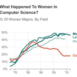
I recently saw this graph at http://www.npr.org/blogs/money/2014/10/21/357629765/when-women-stopped-coding. The topic caught my attention but the labels made me cringe. This graph is challenging to read in color (which turquoise category goes with which line?) and would be impossible to read when printed or photocopied in black…


